Index
- Overview
- Panel Configuration
- Example Configuration
Overview
The Image Map panel allows you to place nodes and links between nodes, and have those nodes/links display configuration, state or timeseries data. The nodes can:
- Be a simple text label, display an icon, or both
- Display a timeseries metric or state returned from the entity
- Utilize conditional coloring of label or icon
Links can:
- Optionally, display a timeseries metric or state returned from the entity
- Utilize conditional coloring for an applied label and/or the link itself
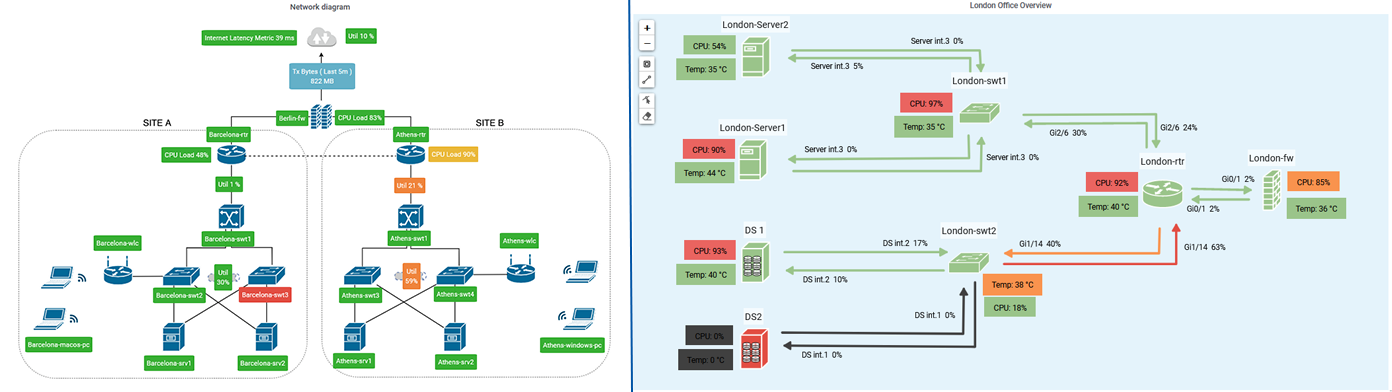
Image Map Configuration
The in-panel editing controls are only available to dashboard editors, and can be used to:
- Add/remove nodes and links in your panel
- Move existing nodes and re-path existing links
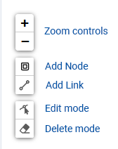
- Zoom controls – zoom in/out on the panel
- Add Node – once enabled, click within the panel to add a new node
- Done – exit mode
- Add Link* – once enabled, click within the panel to begin a new link, clicking again adds a vertex allowing you to path the link as needed
- Done – delete current link (if any) and exit mode
- Finish Link – complete current link (last placed vertex becomes link end-point) and remain in ‘add link’ mode
- Cancel Link – delete current link (if any) and remain in ‘add link’ mode
- Edit Mode* – relocate nodes while maintaining all link connections, re-path links by dragging link-handles,
- Done – exit mode
- Duplicate – once enabled, click an existing node/link to duplicate the entity
- Delete Mode* – click any node/link to delete the selected item
- Done – exit mode
* – requires both dashboard editor permission for the active user account AND the panel-specific option Show Edit Control = enabled (default value)
Entering Edit Mode will display link handles at each end-point and vertex. Markers are also displayed at the mid-point of each link segment.
- Drag a link handle to re-path the link
- Left-click a mid-point to convert it to a vertex (creating new midpoints)
- Right-click to delete the handle, simplifying the link
Clicking the panel header opens the panel menu, offering the following options:
- View – view the panel in fullscreen mode
- Edit – edit the panel configuration
- Share – options for sharing the panel contents with others, both internal and external to your organization
- More
- Duplicate – place a duplicate of the panel on the current dashboard
- Copy – copy the dashboard configuration in order to add the panel to another dashboard
- Panel JSON – view/edit the JSON underlying the panel configuration
- Toggle Legend – show/hide the legend
- Remove – delete the panel from the dashboard
You can edit the panel configuration by:
- Clicking the panel title to open the panel menu and selecting Edit
Panel Configuration Best Practice
General Image Map Construction
When the image map will display multiple instances of output from any one query:
- Place and completely configure a single node/link (units, appearance, labels, conditional coloring, etc.)
- Duplicate this node/link updating the target entity (and label/icon) as needed
The in-panel editing tools allow you to begin your panel configuration by adding and positioning nodes, generating links between nodes, and then working through the node and link configurations one-by-one – generally, this will not be the best way to proceed.
Image maps may utilize multiple queries, and typically display multiple instances of output from any one query. For example, if your image map is displaying Ping RTT there will typically be multiple nodes displaying Ping RTT for a range of network devices.
Rather than placing nodes and then configuring each individually, it is more efficient to completely configure a single node and then duplicate this node, updating the configuration as needed, in many instances the only required update will be the target entity.
Link Positioning/Pathing
When positioning links, the link ends will snap to attachment points on the nodes (attachment points can hold any number of links), this ‘snapping’ behavior can be overridden by holding the Alt key while positioning the link.
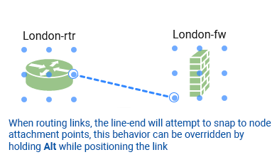
While in Edit Mode:
- Drag a link handle to re-path the link
- Left-click a mid-point to convert it to a vertex (creating new midpoints)
- Right-click to delete a handle, simplifying the link
General
The General tab is used to configure the panel title, description, and panel-level links.
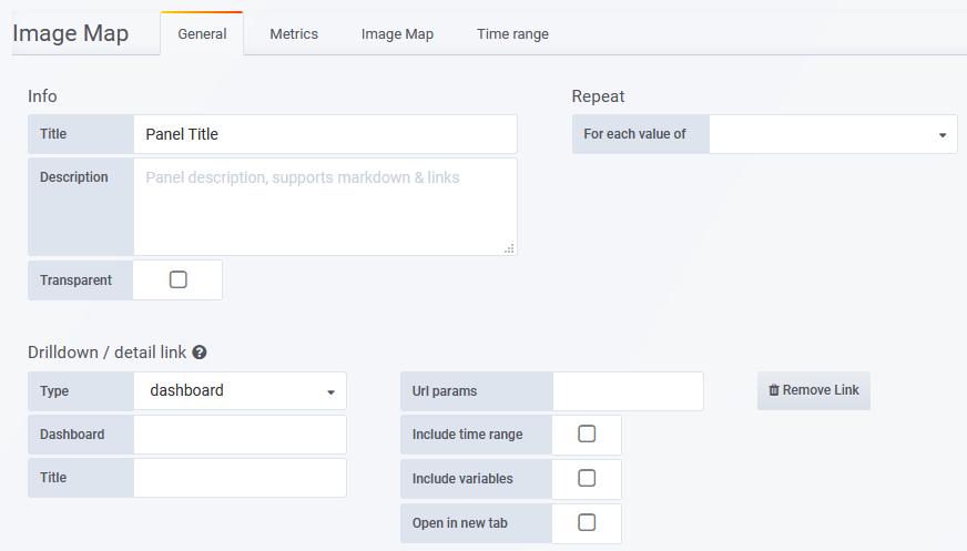
- Title – the panel title, displayed at the top
- Description – the panel description, displayed on hover of info icon in the upper left corner of the panel
- Transparent – if checked, removes the solid background of the panel (default not checked)
- Repeat – repeat a panel for each value of a variable, see Repeating Panels for details
- Drilldown / detail link – apply a panel-level link
- Type
- dashboard – link will target a Statseeker dashboard on the server
- absolute – link will target a URL, other protocols such as mailto:// and ssh:// can also be referenced
- report – link will target a Statseeker report on the server
- Dashboard/URL/Report – the dashboard/URL/report to link to
- Tooltip – the tooltip to display on mouseover, can make use of dashboard variables
- Url Params – (requires Type = dashboard/report)key=value pairs to be appended to the end of the URL as parameters
- Include time range – include the current panel time range as a URL parameter
- Include variables – include all dashboard variables as key=value pairs to be appended to the end of the URL as parameters
- Open in a new tab – open the linked destination in a new tab
- Type
Metrics
The Metrics tab is used to configure the data series to be graphed. What options are available in the Metrics tab depends upon which Query Type is being used, see Query Types for details.
Image Map
The Image Map tab is used to configure the appearance of both the panel and the data displayed within the panel.
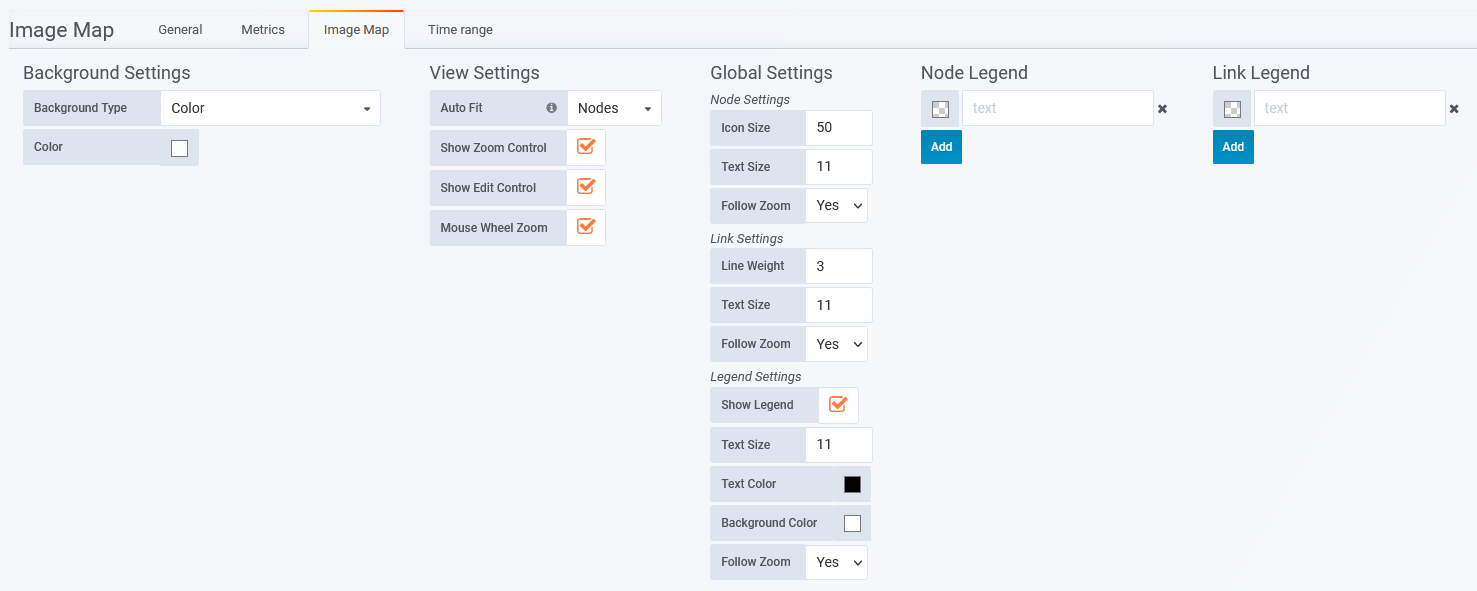
Background Settings
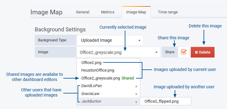
- Background Type – Specify the panel background
- Color – a solid color background
- External Image URL – an image resource hosted externally to the Statseeker server
- Uploaded Image – a local image file that is uploaded and stored on the Statseeker server
- Image – requires Background Type = External Image URL/Uploaded Image. Enter the URL for external images or select from the list of uploaded images.
- Color – specify the color of the panel background
- The Color option can be combined with an image resource
- Images will scale (fixed ratio) to fit the panel, but only scale upwards to the original image dimensions. Using a large dimension image allows for greater scope in presentation.
Uploaded Images
Dashboard editors and administrators can upload images to the Statseeker server for use in Image Map panels (for details see Dashboard Roles and Permissions).
| Dashboard Role | Abilities\Limitations |
| Editor |
|
| Admin |
|
Uploaded images have the following restrictions:
- Max size 5Mb
- Formats: .jpg, .jpeg, .png, .bmp, .gif
- Filename can only contain alphanumeric characters, dashes, underscores, and periods
- Filename must be unique on the Statseeker server
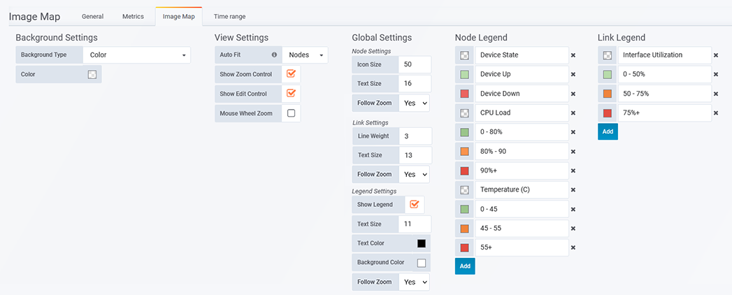
View Settings
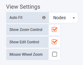
- Auto Fit –
- Disabled – manual positioning (pan and zoom) of the background within the panel boundary
- Nodes – automatically pan the panel to center the display on the nodes and zoom to fit all nodes within the current panel boundary
- Image – (requires Background Type = Uploaded Image/External Image URL) automatically pan the panel to center the display on the background image and zoom to fit the image within the current panel boundary
- Save View – requires Auto Fit = Disabled. The current view settings (including zoom and pan states) are saved as the default settings for the panel and referenced whenever the panel is displayed/reloaded.
- Show Zoom Control – display/hide in-panel zoom controls
- Show Edit Control – display/hide in-panel node and link editing tools
- Mouse Wheel Zoom – enable/disable mouse wheel zoom of the panel content
Global Settings
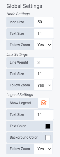
- Node Settings –
- Icon Size – default node size
- Text Size – default node text (label/entity and metric values) size
- Follow Zoom:
- Yes – icons scale to match the panel zoom
- No – icons do not scale with zoom setting
- Link Settings –
- Line Weight – link line weight
- Text Size – default link text (label/entity and metric values) size
- Follow Zoom:
- Yes – links scale to match the panel zoom
- No – links do not scale with zoom setting
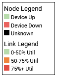
- Legend Settings –
- Show Legend – display/hide the panel legend
- Text Size – legend text size
- Text Color – legend text color
- Background Color – legend background color
- Follow Zoom:
- Yes – legend scales to match the panel zoom
- No – legend does not scale with zoom setting
Node Configuration
Each node placed in the panel generates a node configuration panel in the Image Map tab. Depending on the configuration, the nodes can:
- Be a simple text label or feature an icon
- Display a timeseries metric or entity state returned from one of the queries configured in the Metrics tab
- Utilize conditional coloring of text (label and value) or icon
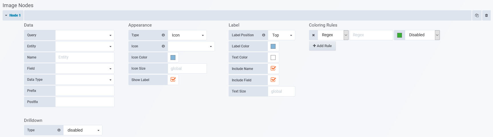
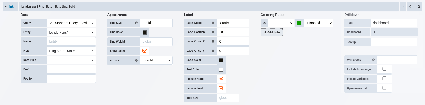
Data
- Query – displayed when the Metrics tab contains multiple queries, select the query to be used for populating the node
- Entity – select an entry from the list of entities returned from the query
- Name – option to override the default node label
- Field – select from the list of metrics returned from the specified query
- Data Type – specify the data type (string, number, or date)
- Unit – requires Metric Type = Number, units to use with number values
- Decimals – requires Metric Type = Number, number of decimal places to display with number values
- Date Format – requires Metric Type = Date, date format to use with date values
- Prefix – string to prepend to metric value
- Postfix – string to append to metric value
Appearance
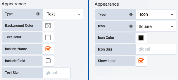
- Type:
- Text – rectangular text box
- Icon – select from a range of shapes/icons
- Background Color – requires Type = Text, default node color
- Text Color – requires Type = Text, color for node content
- Include Name – requires Type = Text, check to display the node name/label, this will be either the Entity or Name as specified in the Data configuration section
- Include Field – requires Type = Text, check to display the associated field value, as returned by the Query
- Text Size – requires Type = Text, specify the text size for the node content
- Icon – requires Type = Icon, specify the icon/shape to use for the node
- Icon Color – requires Type = Icon, specify the default icon color
- Icon Size – requires Type = Icon, specify the icon size (pixels) for the largest dimension (width or height) of the icon
- Show Label – toggle display of node label
- Show Metric – check to display the assigned metric value
- Node Size – override the global node size for the node
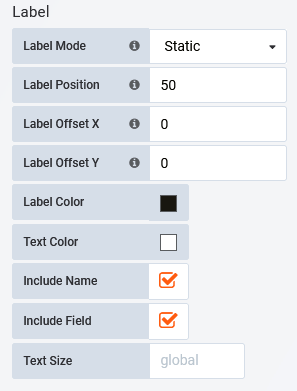
Label
The Label configuration requires that:
- Appearance > Type = Icon
- Appearance > Show Label is checked
This configuration specifies the appearance and content of the optional icon label.
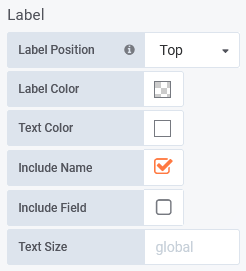
- Label Position – position relative to the icon
- Label Color – default label background color
- Text Color – default label text color
- Include Name – toggle display of node name, this will be either the Entity or Name as specified in the Data configuration section
- Include Field – toggle display of the associated field value, as returned by the Query
- Text Size – specify label text size
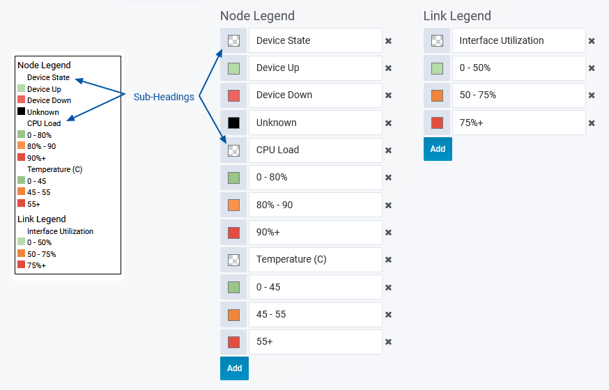
Coloring Rules
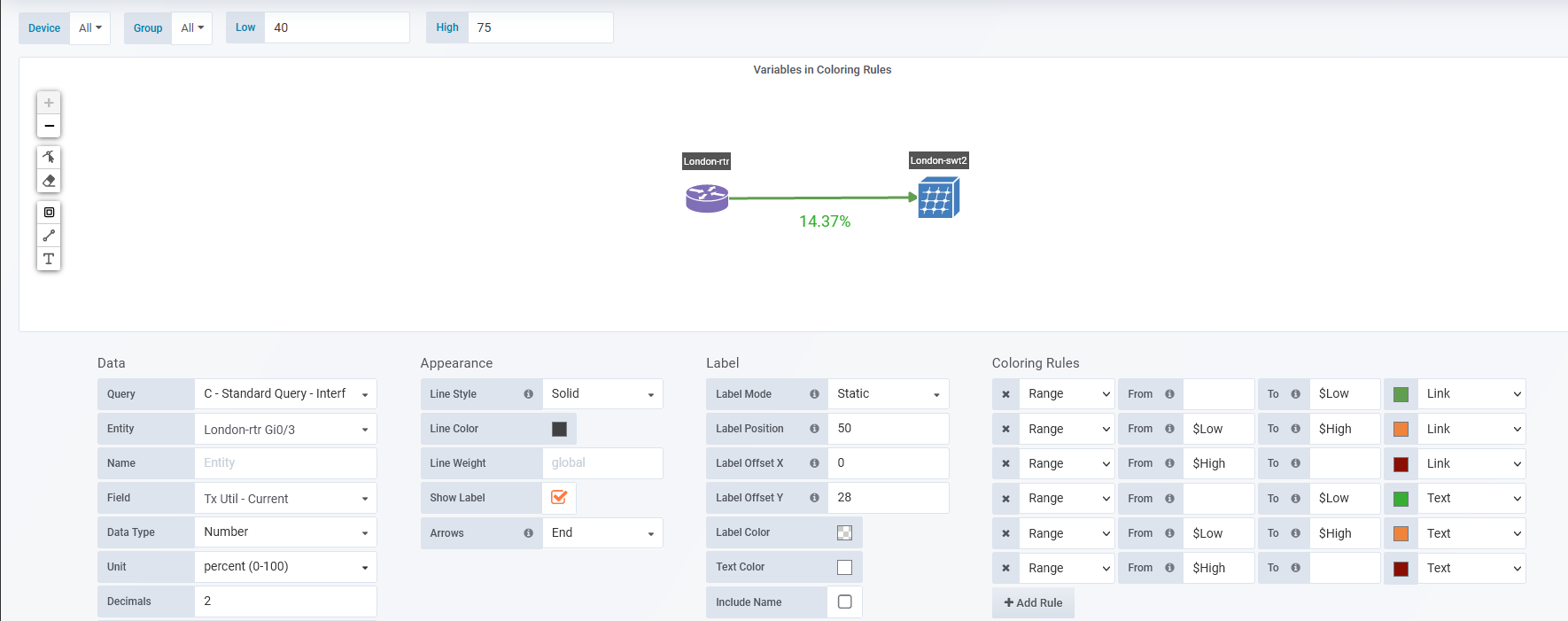
The options presented in Coloring Rules are determined by the Metric Type. Colors can be assigned to override the default font and background colors for the node, icon and label.
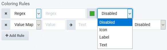
- Regex – requires Metric Type = String, specify a regex filter, and the color to apply to values satisfying that filter
- Value Map – requires Metric Type = String, specify the matching string Value, the Text to display instead of that value, and assign a color to apply in that instance
- Range – requires Metric Type = Number, assign the start and endpoints of the range, and a color to assign when values fall within that range
In the above configuration, 0-79.99. will be green, 80-94.99. will be orange, and 95+ will be red.
Dashboard variables can be referenced in Coloring by specifying the variable Name (not label).
Drilldown
Optionally, configure a link to be triggered on click of the node.
- Type
- disabled – (default) no link
- dashboard – link will target a Statseeker dashboard on the server
- absolute – link will target a URL, other protocols such as mailto:// and ssh:// can also be referenced
- report – link will target a Statseeker report on the server
- Dashboard/URL/Report – the dashboard/URL/report to link to
- Tooltip – the tooltip to display on mouseover, can make use of dashboard variables
- Url Params – (requires Type = dashboard/report)key=value pairs to be appended to the end of the URL as parameters
- Include time range – include the current panel time range as a URL parameter
- Include variables – include all dashboard variables as key=value pairs to be appended to the end of the URL as parameters
- Open in a new tab – open the linked destination in a new tab
Configuration Row Actions
Each row configuration features the following actions on the right-hand side of the row header:
 – reorder the node configurations
- Duplicate – duplicate the node configuration
- Delete – delete the node configuration
Link Configuration
The Links section contains the configuration blocks for each link being displayed in the panel. Depending on the configuration, the links can:
- Display text label
- Display a timeseries metric or state returned from the entity
- Utilize conditional coloring of both the link and any associated text
Data
- Query – displayed when the Metrics tab contains multiple queries, select the query to be used for populating the link
- Entity – select an entry from the list of entities returned from the query
- Name – option to override the default node label
- Field – select from the list of metrics returned from the specified query
- Data Type – specify the data type (string, number, or date)
- Unit – requires Metric Type = Number, units to use with number values
- Decimals – requires Metric Type = Number, number of decimal places to display with number values
- Date Format – requires Metric Type = Date, date format to use with date values
- Prefix – string to prepend to metric value
- Postfix – string to append to metric value
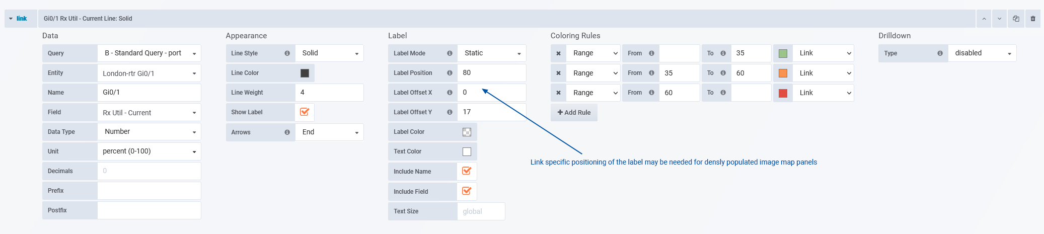
Appearance
- Line Style – solid or dashed
- Line Color – default link color
- Line Weight – link line weight/thickness
- Show Label – toggle display of the link label
- Arrows – which ends of the link display an arrow, relative to the link origin
- Disabled – no arrowheads displayed
- End – display arrowhead on link termination only
- Start – display arrowhead on link origin only
- Both – display arrowhead on both ends of link
Label
The Label configuration requires that Appearance > Show Label is checked. This configuration specifies the appearance and content of the optional link label.
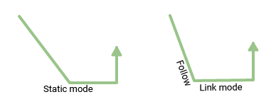
- Label Mode –
- Follow Link – the label orientation will follow the link pathing
- Static – the label orientation is independent of the link orientation
- Label Position – distance (percent) along the link that the label will be displayed, 0 = link start, 100 = link end
- Label Offset – (requires Label Mode = Follow Link) vertical distance (pixels) the label is offset from the link path
- 0 = centered
- negative values = above
- positive values = below
- Label X Offset – (requires Label Mode = Static) horizontal distance (pixels) the label is offset from the link path
- 0 = centered
- negative values = left
- positive values = right
- Label Y Offset – (requires Label Mode = Static) vertical distance (pixels) the label is offset from the link path
- 0 = centered
- negative values = above
- positive values = below
- Label Color – (requires Label Mode = Static) default label background color
- Text Color – default label text color
- Include Name – toggle display of node name, this will be either the Entity or Name as specified in the Data configuration section
- Include Field – toggle display of the associated field value, as returned by the Query
- Text Size – specify label text size
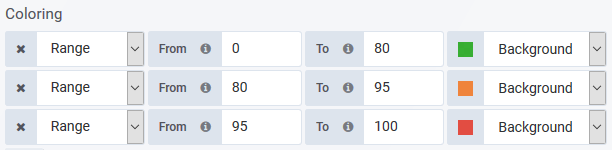
Coloring Rules
The options presented in Coloring Rules are determined by the Metric Type. Colors can be assigned to override the default font and background colors for the node, icon and label.
- Regex – requires Metric Type = String, specify a regex filter, and the color to apply to values satisfying that filter
- Value Map – requires Metric Type = String, specify the matching string Value, the Text to display instead of that value, and assign a color to apply in that instance
- Range – requires Metric Type = Number, assign the start and endpoints of the range, and a color to assign when values fall within that range
In the above configuration, 0-79.99. will be green, 80-94.99. will be orange, and 95+ will be red.
Dashboard variables can be referenced in Coloring by specifying the variable Name (not label).
Drilldown
Optionally, configure an HTML link to be triggered on click of the link object.
- Type
- disabled – (default) no link
- dashboard – link will target a Statseeker dashboard on the server
- absolute – link will target a URL, other protocols such as mailto:// and ssh:// can also be referenced
- report – link will target a Statseeker report on the server
- Dashboard/URL/Report – the dashboard/URL/report to link to
- Tooltip – the tooltip to display on mouseover, can make use of dashboard variables
- Url Params – (requires Type = dashboard/report)key=value pairs to be appended to the end of the URL as parameters
- Include time range – include the current panel time range as a URL parameter
- Include variables – include all dashboard variables as key=value pairs to be appended to the end of the URL as parameters
- Open in a new tab – open the linked destination in a new tab
Time Range
Apply an override to the dashboard-wide timefilter. Panels with time range overrides refresh, but do not alter their timefilter, when a user:
- Alters the dashboard time filter settings
- ‘Zooms in’ on a graph panel on the same dashboard, changing the timefilter applied to the dashboard
Using panel specific timefilter overrides allows you to easily create dashboards which compare the same data (entity and metric) for different time ranges:
- Today vs yesterday
- This week so far vs last week
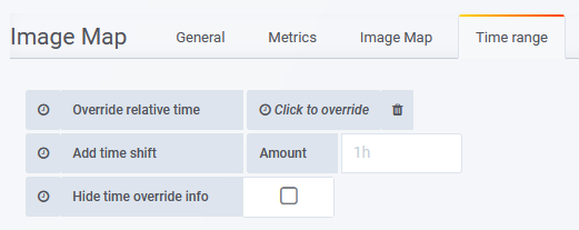
- Override relative time – specify a time range for the panel
- Add time shift – Amount – override the ‘now’ point with respect to the timefilter being applied to the graph
- Hide time override info – when unchecked, the current time override setting is displayed in the top-right of the graph header
Example Configuration – image background and multiple queries
This example will illustrate the query and panel configuration used to produce the ImageMap panel presented below.
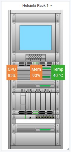
Metrics Tab
The panel presents 3 different metrics (CPU load, Memory Load, and Temperature), so the Metrics tab contains 3 queries, 1 for each of these metrics
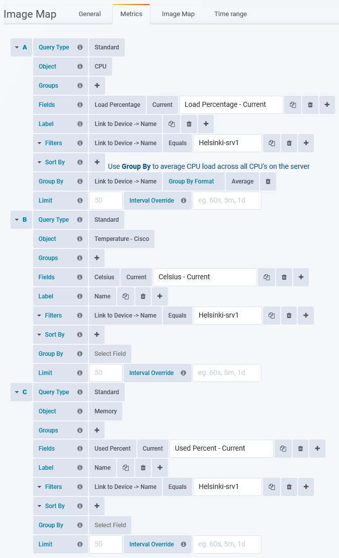
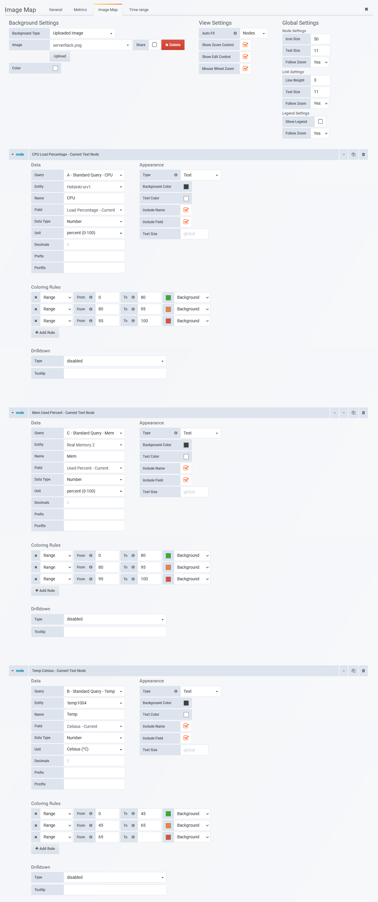
Image Map Tab
Each node presents data from one of the queries defined in the Metrics tab.
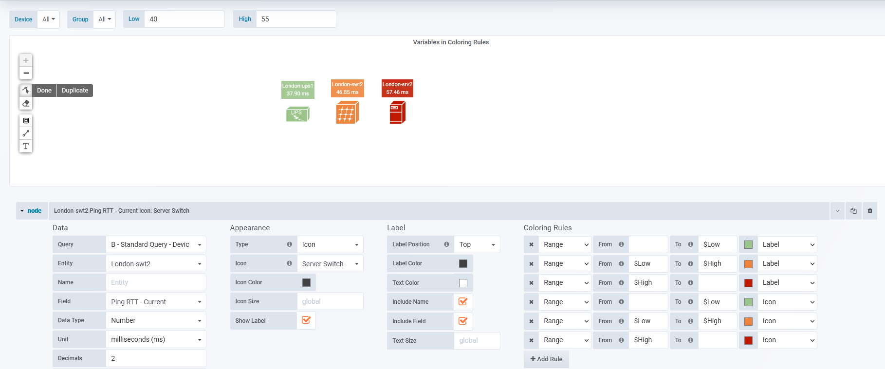
Example Configuration – network topology using nodes and links
This example uses both nodes and links to present a basic office topology.
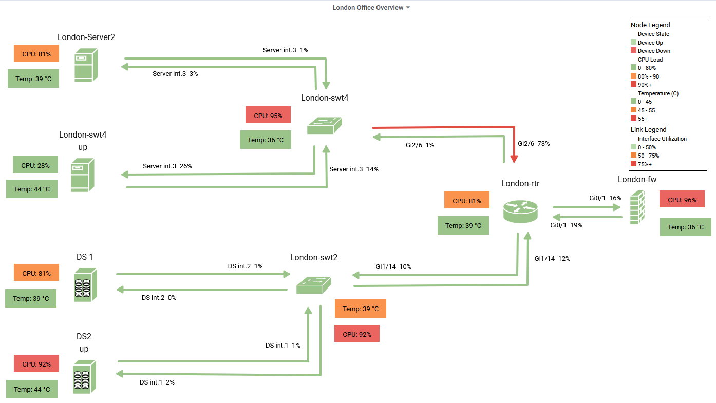
Metrics Tab
Four queries returning:
- Current Device Ping-State
- Current Interface Utilization (Rx/Tx), when configuring links we will be focusing on the dedicated links between the device nodes
- Current CPU Load, aggregated (averaged) across all CPUs on the device
- Current Temperature (C), aggregated (averaged) across all temperature sensors on the device
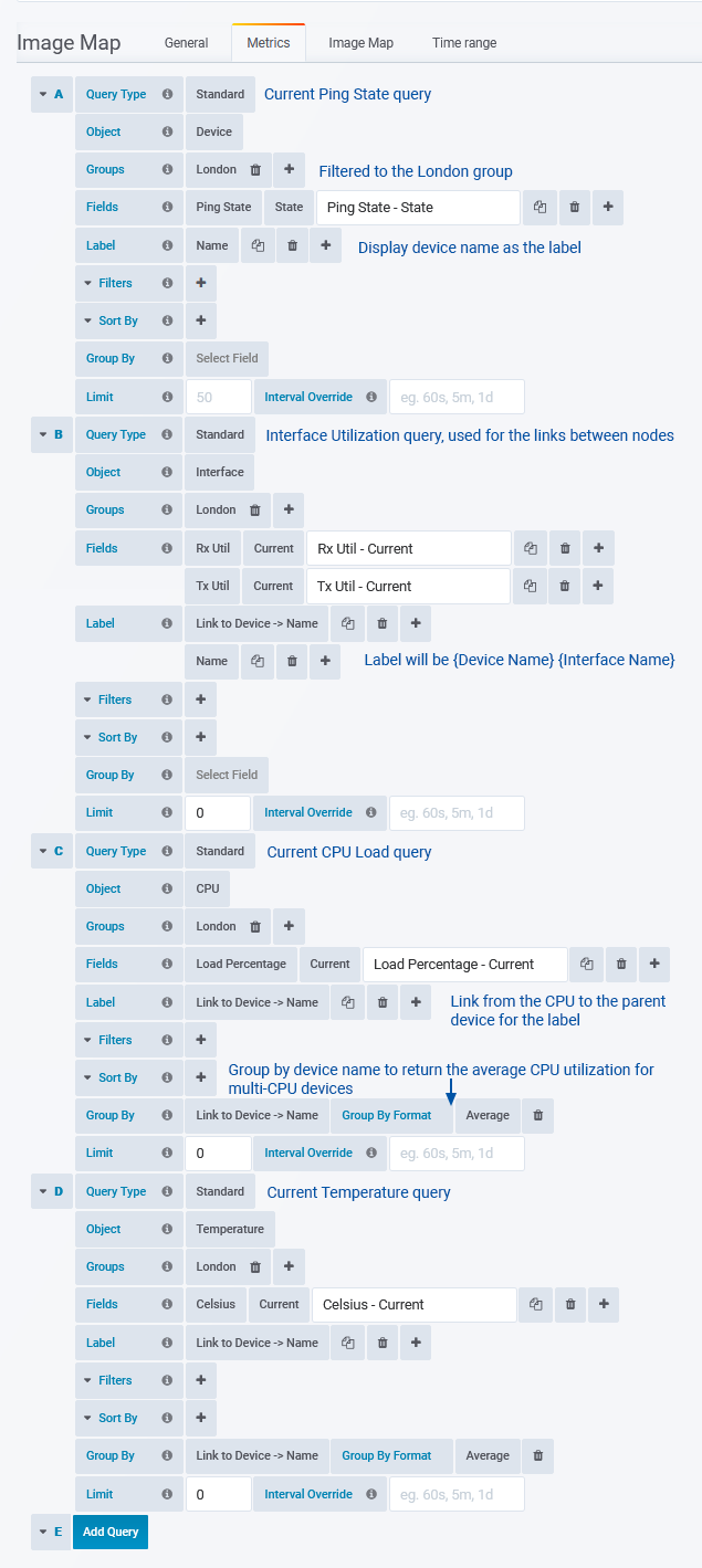
Image Map Tab
Background, View, Global and Legend Settings
Node Configuration
Configure a single Device Ping-State node, then duplicate the node, updating the target Data > Entity and Appearance > Icon, and reposition as needed to populate the panel.
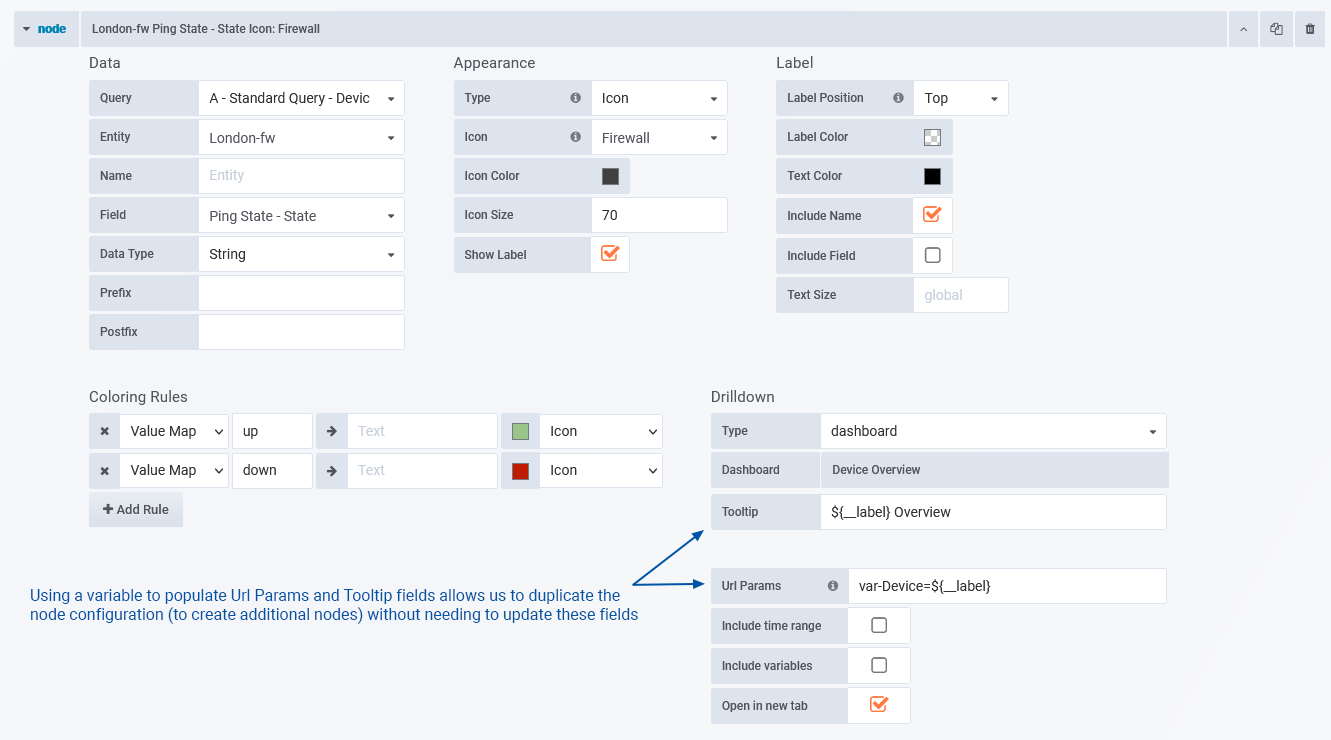
- Set Appearance > Type = Icon and assign an icon to suit the target device type
- Label > Include Field = unchecked as we are using coloring rules to indicate the device state, so we don’t need to display the device state in the label
- We have configured a Drilldown link for the node, pointing the Device Overview dashboard, passing through the Label (${__label}) to the Device variable in that destination dashboard. The Label references the content of the Data > Name field.
Once a single ping-state node is configured we can duplicate the node configuration to create additional nodes. We only need to update the Data > Entity and Appearance > Icon fields for the duplicated nodes, speeding the process of populating the image map.
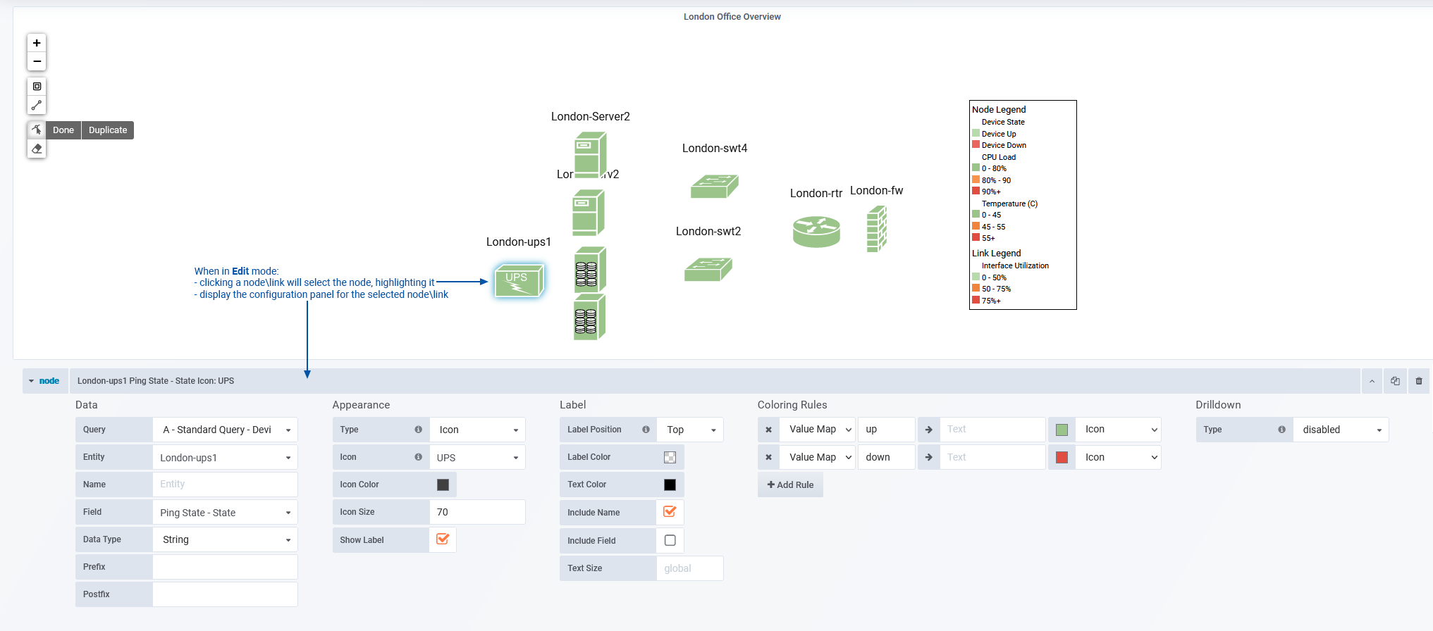
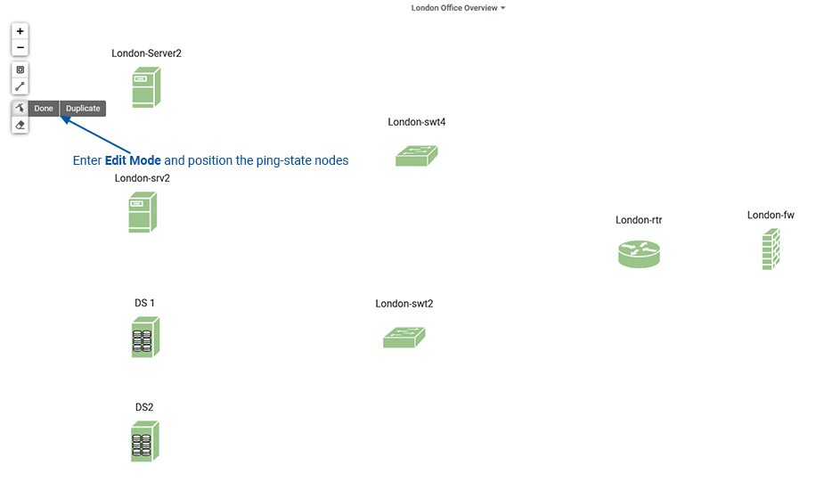
Returning to the dashboard view and enabling Edit Mode allows us to easily position our nodes within the image map panel.
Repeat the process of configuring an initial node, node duplication, and subsequent update, for the CPU and Temperature nodes, for each device in the panel.
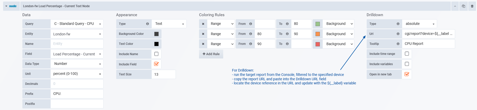
CPU Node Configuration
- We use the Data > Prefix to identify what the node is presenting
- Uncheck Appearance > Include Name as we are going to use the node position to identify the entity
- Apply coloring rules to highlight threshold values
- The Drilldown will be a focused CPU report:
- Type = absolute
- Run the report from the Console, filtered to the specific device, then copy the report URL
- Paste the URL into the Drilldown > URL
- Locate the device filter in the report URL (device=some_device) and replace the value with the label variable (${__label}) – this will allow us to duplicate the node for other devices without needing to update the drilldown URL
- Duplicate, update, position for each device
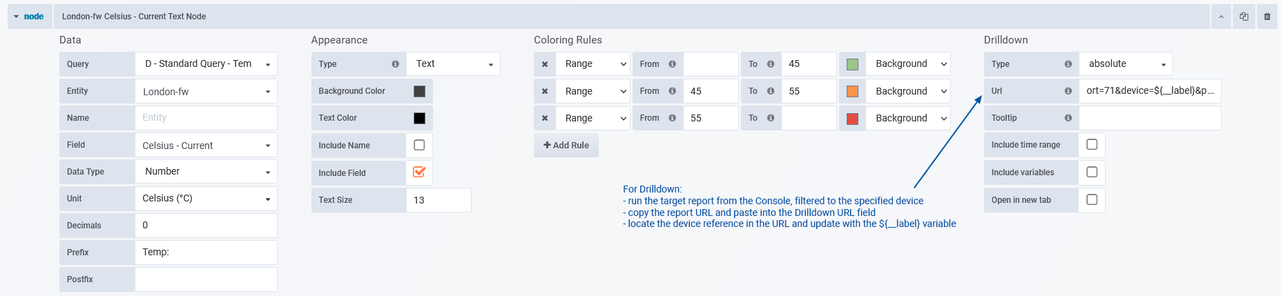
Temperature Node Configuration
- We use the Data > Prefix to identify what the node is presenting
- Uncheck Appearance > Include Name as we are going to use the node position to identify the entity
- Apply coloring rules to highlight threshold values
- The Drilldown will be a focused Temperature report:
- Type = absolute
- Run the report from the Console, filtered to the specific device, then copy the report URL
- Paste the URL into the Drilldown > URL
- Locate the device filter in the report URL (device=some_device) and replace the value with the label variable (${__label}) – this will allow us to duplicate the node for other devices without needing to update the drilldown URL
- Duplicate, update, position for each device
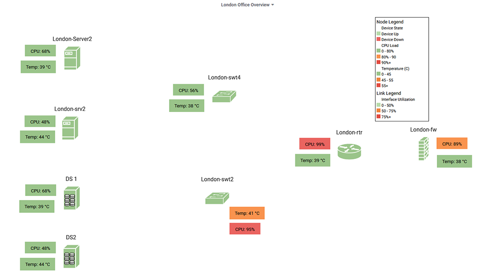
Link Configuration
Configure a single Interface Utilization node, then duplicate the link, updating the Data > Entity and Data > Field, and reposition as needed to populate the panel.
Once a single link is configured, we can duplicate the configuration to create additional links, speeding the process of populating the image map. We need to update:
- Data > Entity
- Data > Field – we are providing links for both Rx and Tx values
- Label positioning may need to be adjusted for each link to improve in data legibility within the panel
When positioning links, the link ends will snap to attachment points on the nodes (attachment points can hold any number of links), this ‘snapping’ behavior can be overridden by holding the Alt key while positioning the link.
While in Edit Mode:
- Drag a link handle to re-path the link
- Left-click a mid-point to convert it to a vertex (creating new midpoints)
- Right-click to delete a handle, simplifying the link