Legacy Documentation for Statseeker version 5.5.4
Index
- Overview
- Panel Configuration
- Example Configuration
Overview
The Image Map panel allows you to place nodes over a custom background image, and have those nodes display configuration, state or timeseries data. The nodes can:
- Be a simple text label
- Display a timeseries metric or state returned from the entity
- Feature an icon
- Utilize conditional coloring of text or icon
Clicking the panel header opens the panel menu, offering the following options:
- View – view the panel in fullscreen mode
- Edit – edit the panel configuration
- Share – options for sharing the panel contents with others, both internal and external to your organization
- More
- Duplicate – place a duplicate of the panel on the current dashboard
- Copy – copy the dashboard configuration in order to add the panel to another dashboard
- Panel JSON – view/edit the JSON underlying the panel configuration
- Toggle Legend – show/hide the legend
- Remove – delete the panel from the dashboard
Image Map Configuration
You can edit the panel configuration by:
- Clicking the panel title to open the panel menu and selecting Edit
General
The General tab is used to configure the panel title, description, and panel-level links.
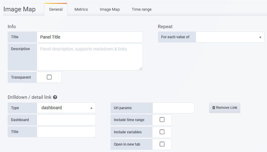
- Title – the panel title, displayed at the top
- Description – the panel description, displayed on hover of info icon in the upper left corner of the panel
- Transparent – if checked, removes the solid background of the panel (default not checked)
- Repeat – repeat a panel for each value of a variable, see Variables for details
- Drilldown – configure panel-level links displayed on hover of info icon in the upper left corner of the panel
- Type – link to a Statseeker dashboard or any URL
- Dashboard/URL – the dashboard or URL to link to
- Title – the display name for the link
- URL params – key=value pairs to be appended to the end of the URL as parameters
- Include time range – include the current panel time range as a URL parameter
- Include variables – include all dashboard variables as key=value pairs to be appended to the end of the URL as parameters
- Open in a new tab – open the linked destination in a new tab
Metrics
The Metrics tab is used to configure the data series to be graphed. What options are available in the Metrics tab depends upon which Query Type is being used, see Query Types for details.
Image Map
The Image Map tab is used to configure the appearance of both the panel and the data displayed within the panel.
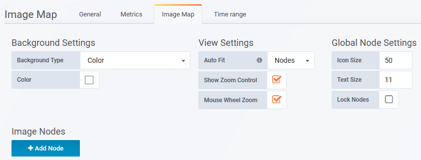
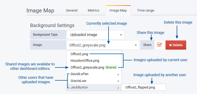
Background Settings
- Background Type – Specify the panel background
- Color – a solid color background
- External Image URL – an image resource hosted externally to the Statseeker server
- Uploaded Image – a local image file that is uploaded and stored on the Statseeker server
- Image – requires Background Type = External Image URL/Uploaded Image. Enter the URL for external images, or select from the list of uploaded images.
- Color – specify the color of the panel background
- The Color option can be combined with an image resource
- Images will scale (fixed ratio) to fit the panel, but only scale upwards to the original image dimensions. Using a large dimension image allows for greater scope in presentation.
Uploaded Images
Dashboard editors and administrators can upload images to the Statseeker server for use in Image Map panels (for details see Dashboard Roles and Permissions).
| Dashboard Role | Abilities\Limitations |
| Editor |
|
| Admin |
|
Uploaded images have the following restrictions:
- Max size 5Mb
- Formats: .jpg, .jpeg, .png, .bmp, .gif
- Filename can only contain alphanumeric characters, dashes, underscores, and periods
- Filename must be unique on the Statseeker server
View Settings
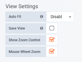
- Auto Fit –
- Disabled – manual positioning (pan and zoom) of the background within the panel boundary
- Nodes – pan panel to center the display on the nodes and zoom to fit all nodes within the current panel boundary
- Image – pan panel to center the display on the background image and zoom to fit the image within the current panel boundary
- Save View – requires Auto Fit = Disabled. The current view settings (including zoom and pan states) are saved as the default settings for the panel and referenced whenever the panel is displayed/reloaded.
- Show Zoom Control – display/hide in-panel zoom controls
- Mouse Wheel Zoom – enable/disable mouse wheel zoom of the panel content
Global Node Settings
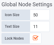
- Icon Size – default node size
- Text Size – default node text (label/entity and metric values) size
- Lock Nodes – allow/prevent repositioning of nodes
Image Nodes
The Image Nodes section contains the configuration blocks for each node being displayed in the panel. Depending on the configuration, the nodes can:
- Be a simple text label
- Display a timeseries metric or state returned from the entity
- Feature an icon
- Utilize conditional coloring of text or icon
Data
- Query – displayed when the Metrics tab contains multiple queries, select the query to be used for populating the node
- Entity – select an entry from the list of entities returned from the query
- Name – option to override the default node label
- Metric – select from the list of metrics returned from the query specified in the Metrics tab
- Metric Type – specify the metric type (string, number, or date)
- Unit – requires Metric Type = Number, units to use with number values
- Decimals – requires Metric Type = Number, number of decimal places to display with number values
- Date Format – requires Metric Type = Date, date format to use with date values
- Prefix – string to prepend to metric value
- Postfix – string to append to metric value
Appearance
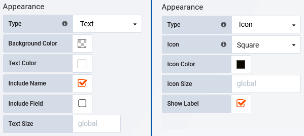
- Type:
- Text – rectangular text box
- Icon – select from a range of shapes/icons
- Background Color – requires Type = Text, default node color
- Text Color – requires Type = Text, color for node content
- Include Name – requires Type = Text, check to display the node name/label, this will be either the Entity ort Name as specified in the Data configuration section
- Include Field – requires Type = Text, check to display the associated field value, as returned by the Query
- Text Size – requires Type = Text, specify the text size for the node content
- Icon – requires Type = Icon, specify the icon/shape to use for the node
- Icon Color – requires Type = Icon, specify the default icon color
- Icon Size – requires Type = Icon, specify the icon size (pixels) for the largest dimension (width or height) of the icon
- Show Label – toggle display of node label
- Show Metric – check to display the assigned metric value
- Node Size – override the global node size for the node
Label
The Label configuration requires that:
- Appearance > Type = Icon
- Appearance > Show Label is checked
This configuration specifies the appearance and content of the optional icon label.
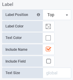
- Label Position – position relative to the icon
- Label Color – default label background color
- Text Color – default label text color
- Include Name – toggle display of node name, this will be either the Entity ort Name as specified in the Data configuration section
- Include Field – toggle display of the associated field value, as returned by the Query
- Text Size – specify label text size
Coloring Rules
The options presented in Coloring Rules are determined by the Metric Type. Colors can be assigned to override the default font and background colors for the node, icon and label.
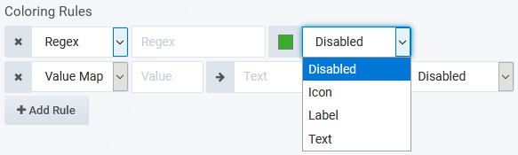
- Regex – requires Metric Type = String, specify a regex filter, and the color to apply to values satisfying that filter
- Value Map – requires Metric Type = String, specify the string Value, the Text to display instead of that value, and assign a color to apply in that instance
- Range – requires Metric Type = Number, assign the start and endpoints of the range, and a color to assign when values fall within that range
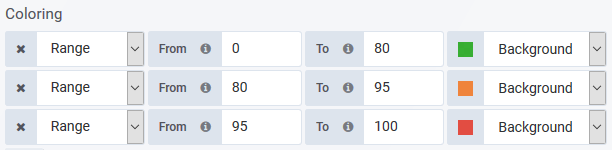
In the above configuration, 0-79.99. will be green, 80-94.99. will be orange, and 95+ will be red.
Drilldown
Optionally, configure a link to be triggered on click of the node.
- Type – set link type: disabled, dashboard or absolute
- URL – for absolute link
- Dashboard – requires Type = Dashboard, select from the list of existing dashboards
- Url Parameters – requires Type = Dashboard, key:value pairs to append to dashboard URL, these can be used to set the value for variables on the target dashboard
- Tooltip – content to display on hover of link element
- Include time range – check to pass the current dashboard timefilter, as a URL parameter, to the link target
- Include variables – check to pass the current values of dashboard variables, as URL parameters, to the link target
- Open in new tab – check to open the target in a new tab
Node Title Bar
- Duplicate – duplicate the node configuration
 – reorder the node configurations
Time Range
Apply an override to the dashboard-wide timefilter. Panels with time range overrides refresh, but do not alter their timefilter, when a user:
- Alters the dashboard time filter settings
- ‘Zooms in’ on a graph panel on the same dashboard, changing the timefilter applied to the dashboard
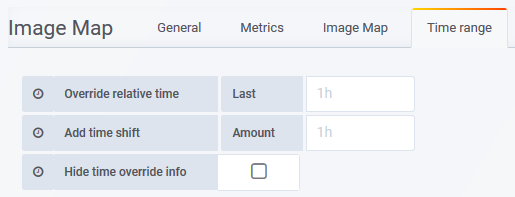
- Override relative time – Last – specify a new time range for the graph, relative to ‘now’
- Add time shift – Amount – override the ‘now’ point with respect to the timefilter being applied to the graph
- Hide time override info – when unchecked, the current time override setting is displayed in the top-right of the graph header
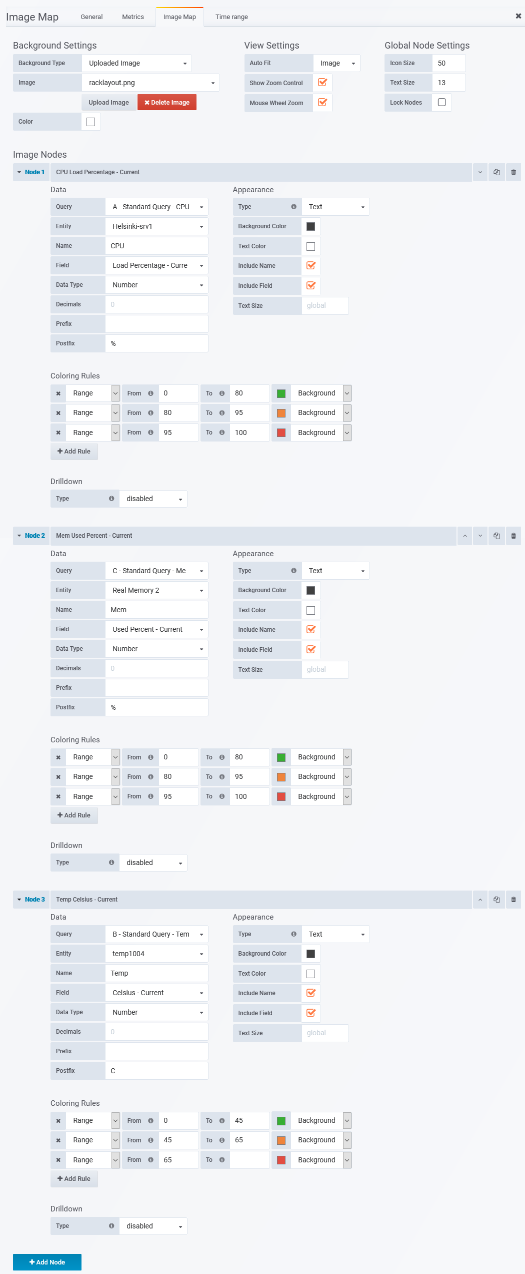
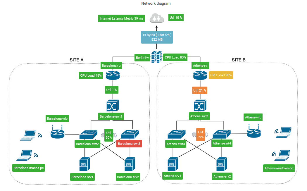
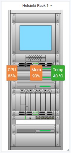
Example ImageMap Configuration
This example will illustrate the query and panel configuration used to produce the ImageMap panel presented below.
Metrics Tab
The panel presents 3 different metrics (CPU load, Memory Load, and Temperature), so the Metrics tab contains 3 queries, 1 for each of these metrics
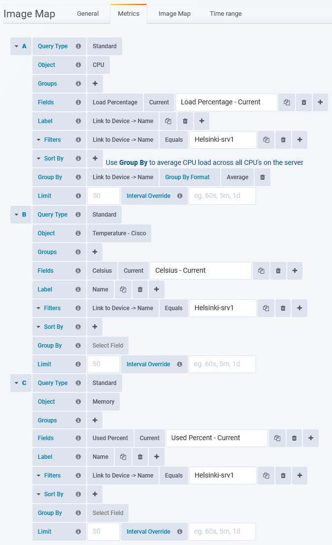
Image Map Tab
Each node presents data from one of the queries defined in the Metrics tab.