Legacy Documentation for Statseeker version 5.5.4
Index
- Overview
- Graph Configuration
- Example Configurations
Overview
The graph panel allows basic point, line and bar graphs for any metrics monitored by Statseeker. Multiple metrics can be plotted on a single graph and individual data series can be isolated for display without needing to reconfigure the panel.
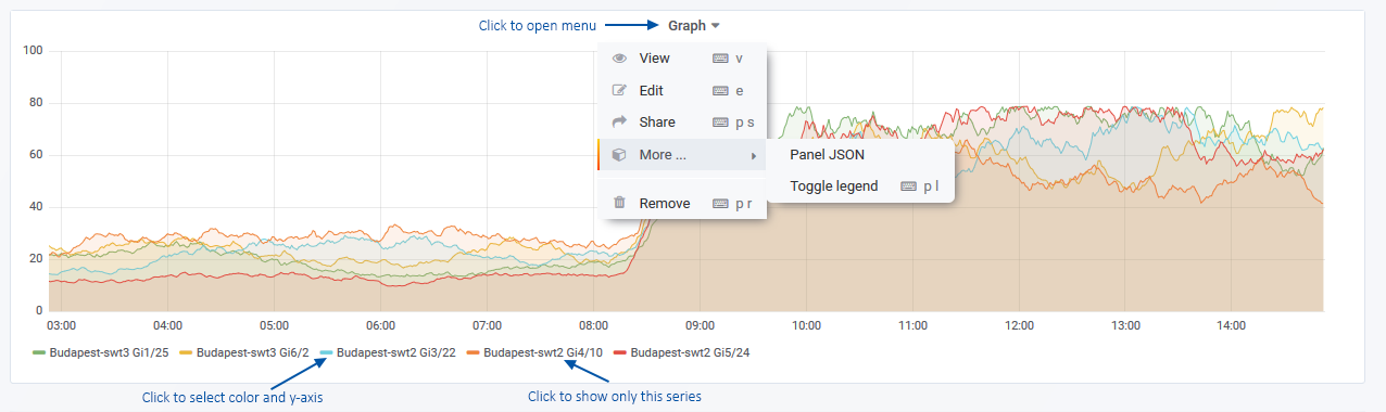
Clicking the panel header opens the panel menu, offering the following options:
- View – view the panel in fullscreen mode
- Edit – edit the panel configuration
- Share – options for sharing the panel contents with others, both internal and external to your organization
- More
- Duplicate – place a duplicate of the panel on the current dashboard
- Copy – copy the dashboard configuration in order to add the panel to another dashboard
- Panel JSON – view/edit the JSON underlying the panel configuration
- Toggle Legend – show/hide the legend
- Remove – delete the panel from the dashboard
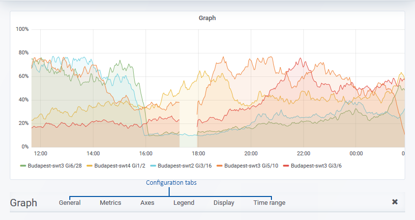
Graph Configuration
You can edit the graph configuration by:
- Clicking the panel title to open the panel menu and selecting Edit
General
The General tab is used to configure the panel title, description, and panel-level links.
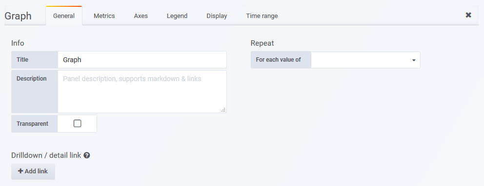
- Title – the panel title, displayed at the top
- Description – the panel description, displayed on hover of info icon in the upper left corner of the panel
- Transparent – if checked, removes the solid background of the panel (default not checked)
- Repeat – repeat a panel for each value of a variable, see Variables for details
- Drilldown – configure panel-level links displayed on hover of info icon in the upper left corner of the panel
- Type – link to a Statseeker dashboard or any URL
- Dashboard/URL – the dashboard or URL to link to
- Title – the display name for the link
- URL params – key=value pairs to be appended to the end of the URL as parameters
- Include time range – include the current panel time range as a URL parameter
- Include variables – include all dashboard variables as key=value pairs to be appended to the end of the URL as parameters
- Open in a new tab – open the linked destination in a new tab
Metrics
The Metrics tab is used to configure the data series to be graphed. What options are available in the Metrics tab depends upon which Query Type is being used, see Query Types for details.
Axes
The Axes tab controls the display of axes.
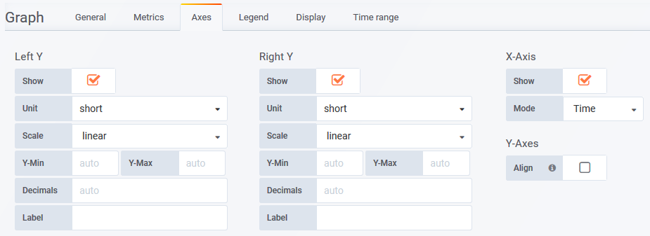
- Show – toggle the display of the axes. The Right-Y axes will only be displayed if a data series has been assigned to it
- Unit – unit for Y values
- Scale – the scale (linear or logarithmic) to use for the Y axis
- Y-Min – minimum Y value
- Y-Max – maximum Y value
- Decimals – number of decimals displayed for Y values
- Label – optional Y axis label
- Mode – X axis can be set to group data by time, data series, or convert the graph to a histogram
- Series > Value – select a data format to use to represent the series
- Histogram > Buckets – the number of buckets to display in the histogram
- Date Format
- Dynamic – the format of dates displayed on the axis and the mouseover dynamically updates to suit the time-range being displayed on the graph
- Static – select to specify a static format for dates displayed on the axis and the mouseover
- Static Format – (requires Date Format = Static) specify the date format for dates displayed on the axis and the mouseover
Tokens:
- %a – Weekday Name (Tue)
- %b – Month Name (Mar)
- %d – Date (31)
- %H – Hours 24h (15)
- %I – Hours 12h (3)
- %m – Month number (6)
- %M – Minutes (08)
- %q – Quarter (4)
- %S – Seconds (08)
- %y – Year 2 digits (19)
- %Y – Year 4 digits (2019)
- %p – am/pm (am)
- %P – AM/PM (AM)
- %w – Weekday (0)
Any combination of text and special tokens, e.g. Date: %d/%b/%y would display as Date: 06/Aug/20
- Align – enable y-axis alignment. If both left and right Y are being displayed it may be useful to align the y axes at a set value.
- Align > Level – value at which to align the left and right y axis
Legend
Options for how the graph legend is presented within the panel.
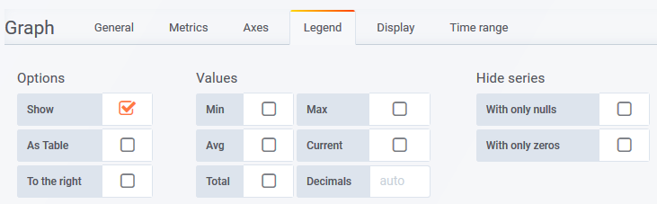
- Show – show/hide legend
- Table – display legend as a table
- To the right – display legend under the graph, or to the right
- Width – minimum width for the legend (px)
- Values – additional values can be displayed with the data series identifier in the legend
- Min – minimum value of the series
- Max – maximum value of the series
- Avg – average value for the series
- Current – current value for the series
- Total – total of all values in the series
- Decimals – number of decimals to display in for values in the legend
- Hide series
- With only nulls – hide any series with only null values
- With only zeros – hide any series for which all values are zero
Display
Configure display styles and overrides for your graph, for examples of common panel-wide and series-specific overrides, see Graph Panel Overrides. The options contained within the tab are broken into four sections:
- Draw options
- Series overrides
- Thresholds
- Time regions
Draw Options
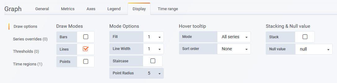
- Draw Modes
- Bars – display as a bar chart
- Lines – display as a line graph
- Points – display as data-points
- Mode Options
- Lines > Fill – how opaque to make the fill under line graphs
- Lines > Line Width – width of line graph
- Lines > Staircase – staircase line graphs
- Points > Point Radius – size of data points
- Hover tooltip
- Mode – on-hover tooltip should display All series, or only the Single series currently under the cursor
- Sort Order – sort order used when presenting all series values in on-hover tooltip
- Stack > Stacked value – set to display Individual or Cumulative values when presenting all series values in on-hover tooltip
- Stacking and Null Value
- Stack – stack all series shown
- Stack > Percent – each series is presented as a percentage of all series displayed
- Null value – how null values are presented
Series overrides – enter display property overrides for individual series on the graph
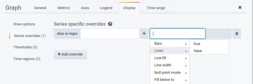
- Add override – add one or more overrides for a series
- Alias or regex – enter an alias, or regex query, to identify the series
 – open the override menu and select a display override
Thresholds – apply threshold indicators to the graph
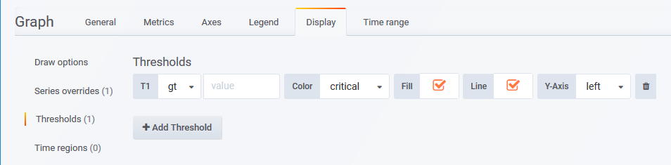
- Add Threshold – add a threshold to the graph
- T1 – ‘Threshold1’, apply threshold to values greater than (gt) or less than (lt) the set value
- Value – threshold value
- Color – color for the threshold indicator
- Fill – overlay a fill to graph according to the threshold
- Y-Axis – which axis the threshold applies to
Time regions – highlight certain time regions of the graph
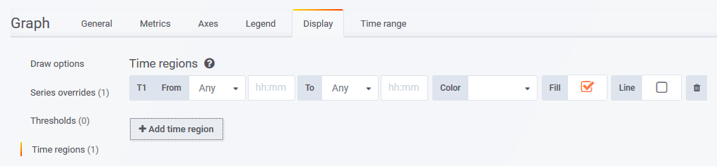
- Add time region – add a highlighted time region to the graph
- T1 From – set start-day/time for the highlight
- To – set end-day/time for the highlight
- Color – set color for the highlight indicator
- Fill – overlay a transparent fill for the time region
- Line – display a line to indicate the start and end points of the highlight
Time Range
Apply an override to the dashboard-wide timefilter. Panels with time range overrides refresh, but do not alter their timefilter, when a user:
- Alters the dashboard time filter settings
- ‘Zooms in’ on a graph panel on the same dashboard, changing the timefilter applied to the dashboard
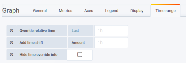
- Override relative time – Last – specify a new time range for the graph, relative to ‘now’
- Add time shift – Amount – override the ‘now’ point with respect to the timefilter being applied to the graph
- Hide time override info – when unchecked, the current time override setting is displayed in the top-right of the graph header
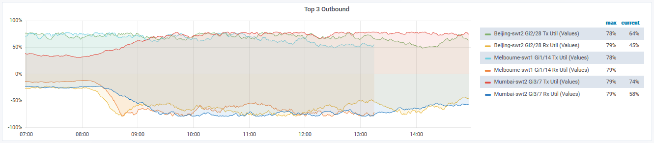
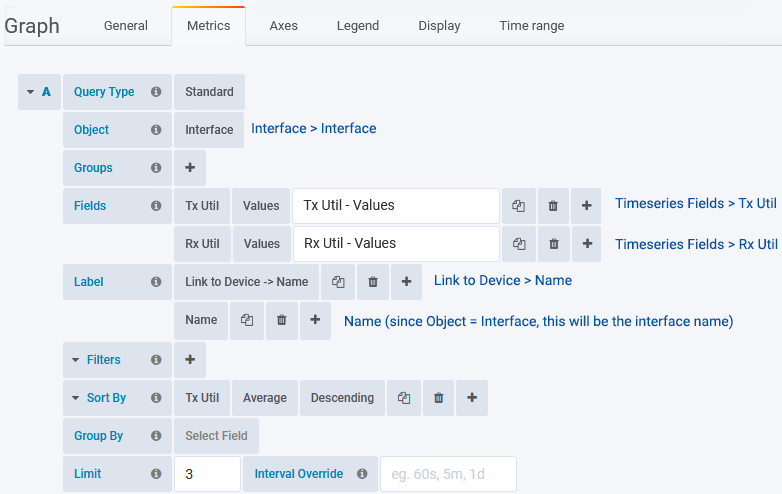
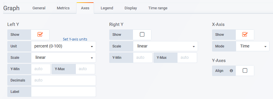
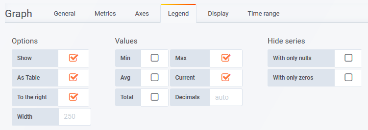
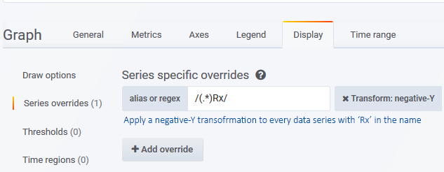
Example: Top 3 Outbound Utilization
The graph presents:
- The 3 interfaces reporting the highest average outbound utilization over the reporting period
- Both inbound and outbound utilization
- The inbound utilization on an inverted Y-axis
- Both the current and maximum values for each series, for each interface, in the legend
Metrics Tab
Axes Tab
Legend Tab
Display Tab
Uses a regex query to select all data series with Rx in the series name, then plots those data series on an inverted Y-axis.
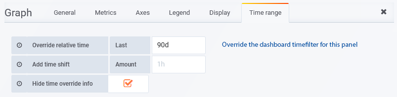
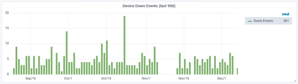
Example: Daily Count of Device Down Events (last 90 days)
The graph presents a daily count of the ‘device down’ events seen across the network over the previous 90 days.
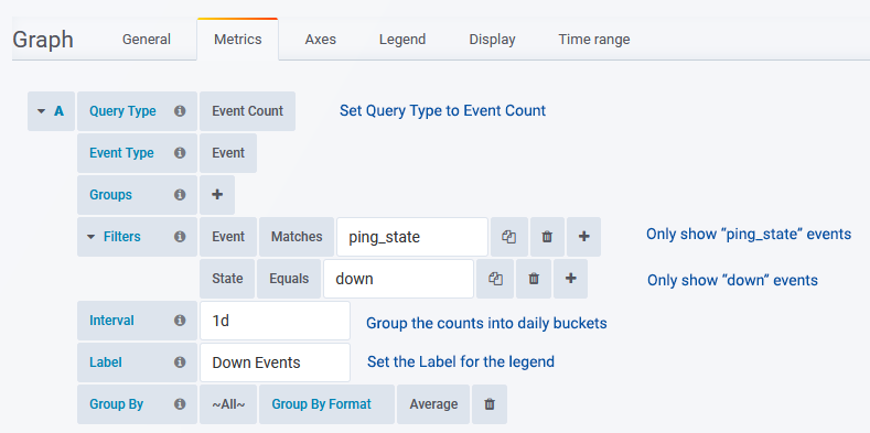
Metrics Tab
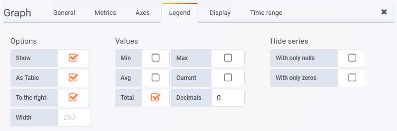
Legend Tab
Time Range
By adding a time range override, the panel is not affected by the timefilter in the top-right of the dashboard.