Index
Overview
When creating your own dashboard content there will be instances where the default configuration for various elements does not present the data in the way you want. In these instances, overrides can be applied to the entire panel or a specific data series within the panel.
Graph panels are both the panel most commonly requiring an override, and the panel with the widest range of override options. Assigning presentation overrides is accomplished from the Display tab where:
- Draw Options (panel-wide)- override the default display properties for all data series presented within the panel
- Series Overrides (series-specific)- overrides applied to one or more specified data series
- Draw Modes: displaying all series as lines (default), bars or points
- Mode Options: settings (such as line-width & point-size) for the selected Draw Modes
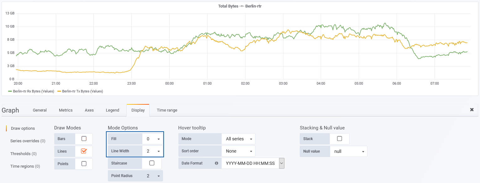
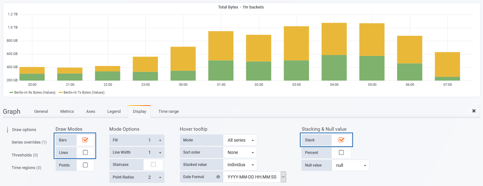
- From within Display tab > Draw Options > Mode Options, set Fill = 0 and Line Width = 2
- Uncheck Lines, and check Bars instead
- Check the Stack option if more than 1 series is to be presented
- Switch to the Metrics tab
- Set the Interval Override to the desired bucket size and refresh the panel
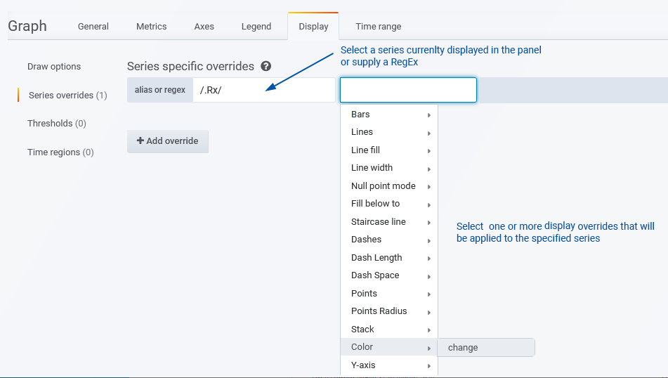
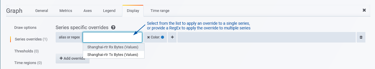
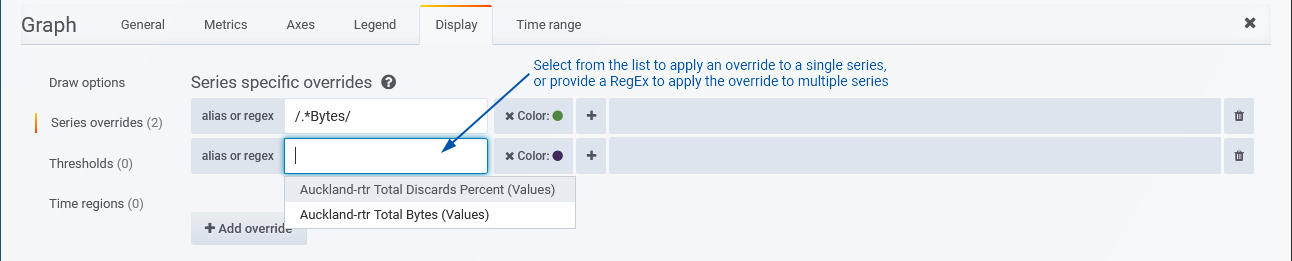
- From the Display tab, select Series Override > Add Override
- Specify a RegEx that will be used to select the series that your override/s will apply to
- Click in the alias or regex field
- Select the series from the list
- Enter a RegEx directly into the alias or regex field
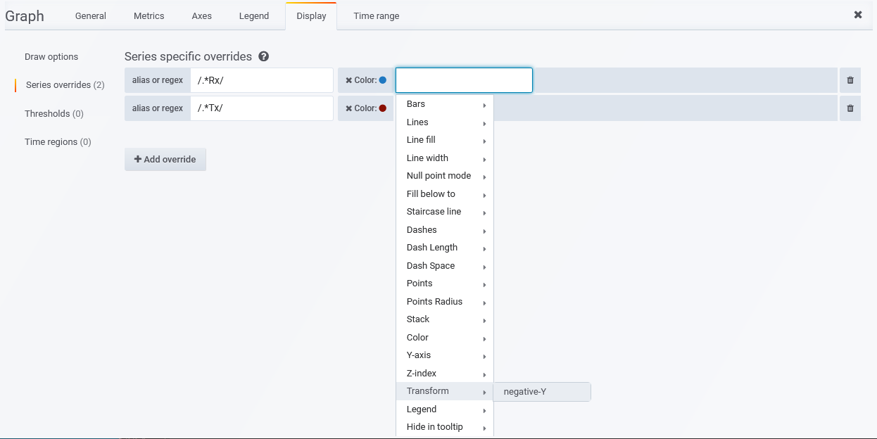
- From the list of overrides, select Transform > negative-Y
- Click in the alias or regex field
- Select the series from the list
- Enter a RegEx directly into the alias or regex field
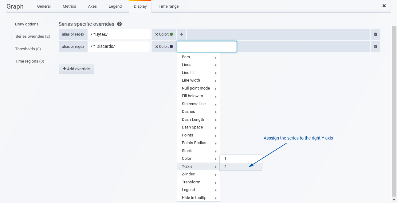
- From the list of overrides, select Y-axis > 2
Draw Options – Bars, Lines & Points
The Draw Options section allows you to override the default presentation of all data within the panel. This includes:
These options offer common display overrides, adjusting the basic presentation of the data series presented in the panel.
Example: Thicker Lines and Remove Fill
The most commonly requested display override is to thicken the graph line and remove the under-line fill.
To accomplish this:
Example: Traffic As Bars with Hourly Counts
The Bars option allows you to present your data as discreet bars rather than a contiguous line graph. The default interval used in graphs displaying timeseries data size is the polling interval of the metric, usually this will be 60sec. When looking at a non-summarized metric, such as bytes counts, you can freely increase the interval used without losing any detail in your data. In this example we will increase the interval used to produce hourly byte-counts of the traffic crossing the device.
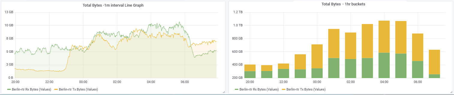
To apply this type of override:
Series Overrides
The Series Overrides option allows you to apply series specific overrides. These overrides can be assigned to an individual series currently presented within the panel, or to any number of series via the use of a RegEx rule. The options available here include all options from the Draw Options section and a wide range of additional options.
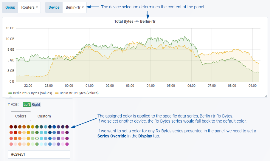
Example: Setting Fixed Colors for Data Series
The color used for plotting a data series can be changed by simply clicking on the color of series in the panel legend and assigning a new color. The limitation on this method is where variables are used to dynamically alter the content of the panel. In the screenshot below, I can assign a color to either of the series being displayed in the panel, but if another device was selected, different data series would be presented and the colors would fall back to the default.
To assign a color override that applies to a specified selection of series:
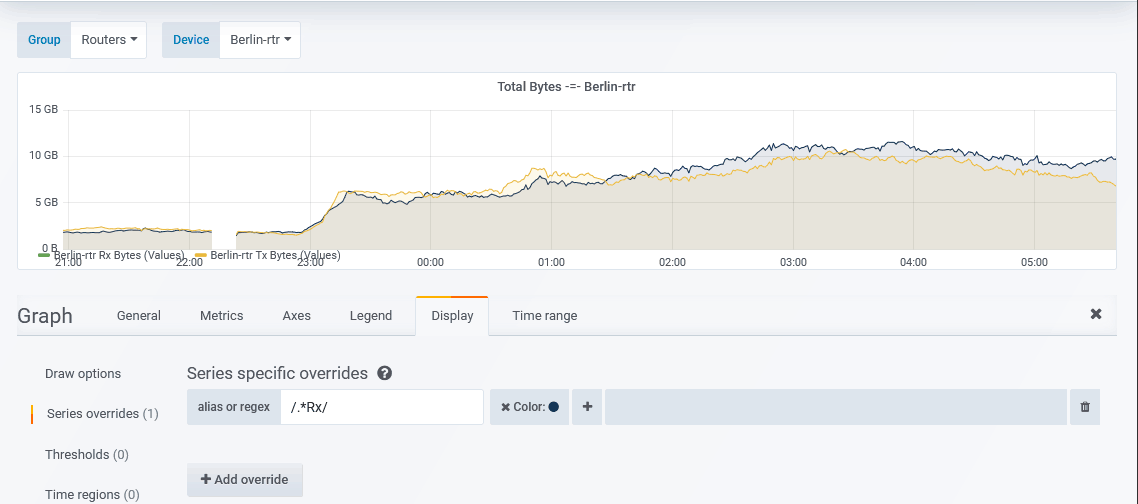
The example below shows a RegEx being applied to assign a static color to any data series with “Rx” in the series name
Once configured, we can use the dashboard variable to select a new device and the color assigned to the Rx Bytes series is maintained.
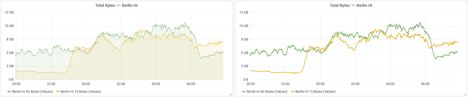
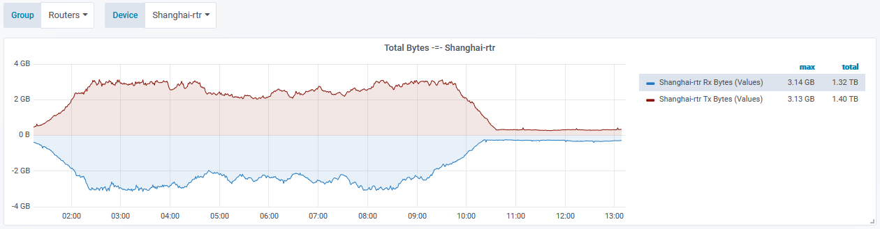
Example: Assign a Series to the Negative-Y Axis
A common convention when presenting both inbound and outbound traffic on a single graph, is to display the inbound traffic on the negative-Y axis. To configure an override for this setting:
To apply the override to a single series:
To apply the override to multiple series:
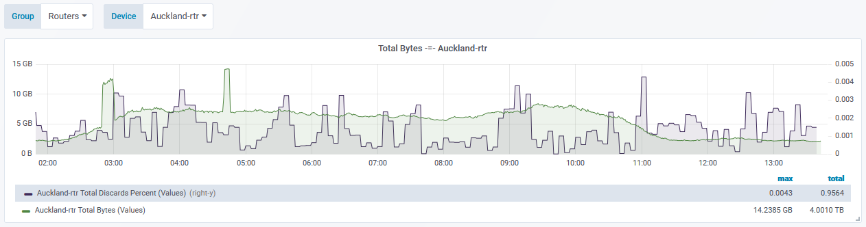
Example: Assign a Series to the Right-Y Axis
When presenting multiple data series where one of the series values are on a different scale to the other, it is useful to assign one of the series to the right-hand Y axis in order to be able to clearly present both sets of data.
To apply the override to a single series:
To apply the override to multiple series: