Index
- Overview
- Adding Trend Data to a Tabular Report
- Adding a Trendline to a Graph
- Considerations when Using Trendline Analysis
Overview
Trendline plotting is a common practice within statistical analysis used to identify a pattern or ‘trend’ being displayed by the data. The trendline works by plotting a ‘line-of-best-fit’ across all data points in the reporting period, the result being a single line representing the trend found within the data with the slope of the line representing the direction and strength of the trend.
A plotted trendline is created from data which can also be displayed in a raw, numerical form in tabulated reports. This allows you to supply trend analysis and predictive data to all relevant reports within Statseeker.
Trend reporting in Statseeker can be used to give an indication of the direction and rate of change for a statistic over the reporting period and into the future. This is particularly useful for capacity planning with regard to disk usage or interface utilization.As with all trend analysis:
- The larger the sample size, the more accurate the data; small reporting periods can lead to misleading trend analysis results
- A predictive trend becomes less reliable the further into the future it is calculated
Trend data can be added to any custom report created in the Custom Reporting Console.
Adding Trend Data to a Tabular Report
Statseeker offers a range of trend data for inclusion in custom tabular reports, for more information on using the Custom Reporting Console see Custom Reports.
- Trend Daily Change – the average daily delta value (i.e. the predicted daily change in the average value for the metric) across each day throughout the reporting period (or, when the reporting period is less than a day, the amount the metric is expected to change over a day). A positive value indicates an increase in the recorded metric, and a negative value, a decrease.
- Trend Strength – indicates how variable the data-set is (R-Squared value). It represents how closely the data points lie along the trendline, if most data points are close to the trendline, then the Trend Strength will be higher, if the data varies quite a bit then the Trend Strength will be lower.
Trend Strength simply indicates how variable the data is:
- A high Trend Strength is not “better” than a low Trend Strength
- The value does not reflect the accuracy of the trendline, trendlines are simply a statistical analysis applied to the data-set and are innately accurate
- The value does not reflect the ‘rate of change’/slope of the trendline
- Trend Prediction – the value on the trend if it was projected into the future while maintaining the same trend strength
To add trend data to a report:
- Select Console > Custom Reporting Console from the Statseeker header
- Click Edit
- Select the report you want to add trend data to
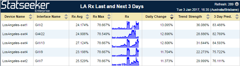
In the example used here we have selected an interface received traffic report so that is the metric we will be retrieving trend data on.
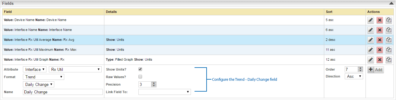
- Add a new field by selecting the desired metric, in this instance, Interface – Rx Util
- Set the Format field to Trend
This will display an additional field under Trend offering a drop-down list of trend analytic options.
- Select a trend analytic option
- Name the field to suit
- Click Add
- This process can be repeated to add additional trend analytics as desired
In the example below, we have added fields for Trend Strength and a 3 day Trend Prediction.
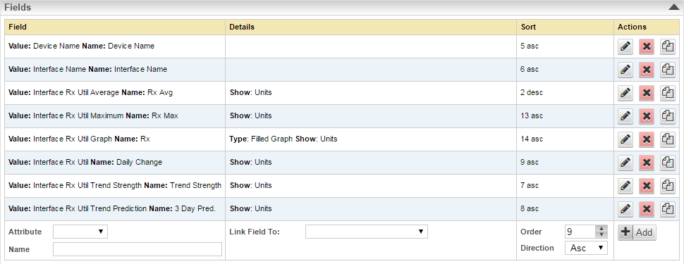
- Save the report
Adding a Trendline to a Graph
To add trend data to a report:
- Select Console > Custom Reporting Console from the Statseeker header
- Click Edit
- Select the report you want to add trend data to
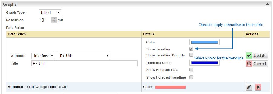
In the example used here we have selected an interface traffic report.
- From the Graphs section, select a metric that you want to have a trendline applied to and click the edit button
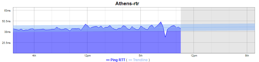
- Check the Show Trendline box to apply a trendline
- Set the Trendline Color
- Click Update
- Repeat this process for any other metrics displayed on the graph that you also want trendlines applied to
- Click Save
- View the report
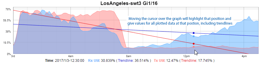
There is also an option to display Trendline Bounds on any graph displaying a trendline. The trendline bounds refer to the range of expected values around the trendline for a given point on the graph. To display trendline bounds:
- Open the report in Edit mode
- Select the metric for which you want to display trendline bounds and click the edit button
- Check the Show Trendline Bounds box and click Update
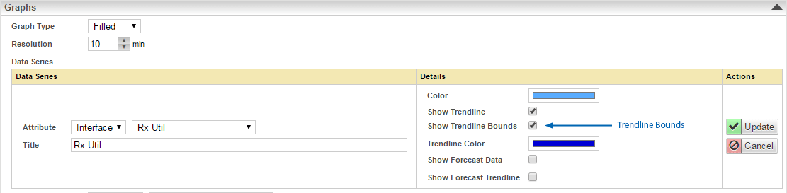
- Save the report
- View the report
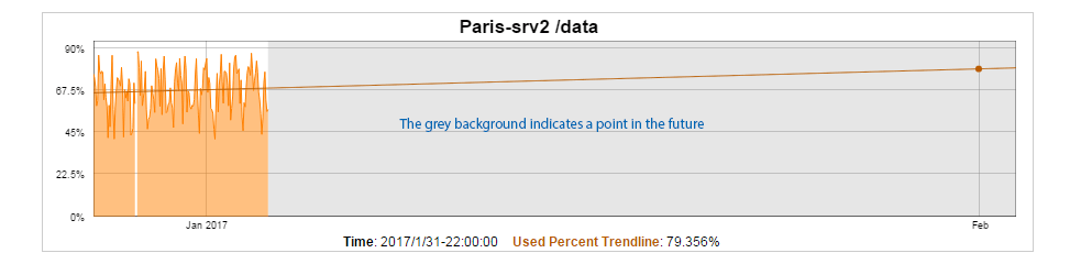
Trendlines on graphs can be projected out into the future to provide an indication of the impact of the trend over time. This can be used for capacity planning by offering some indication of when thresholds may be reached if the trend holds true. To project a trendline into the future simply adjust the time filter so that the reporting period extends into the future.
E.g. now – 30d to now +30d or start-of-this-month to end-of-next-month. For more information on setting time filters and populating time filter lists by adding new time filter favorites, see Time Filters.
Considerations when Using Trendline Analysis
The same considerations around sample size and non-representative data should also be held when working with trendline analysis as the effect that these issues can have is very obvious when applied to trendlines.
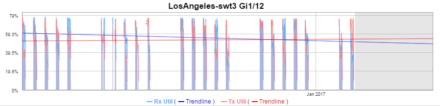
In the example below, we are looking at the traffic across an interface from 3 days previous to 7 days into the future.
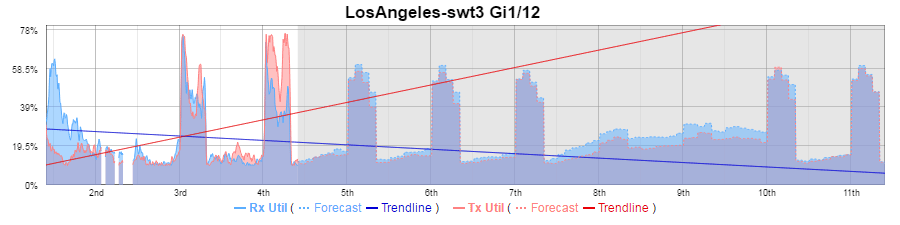
The trendline indicates that the transmitted traffic is increasing very rapidly, and the received traffic, decreasing rapidly.
Sample Size
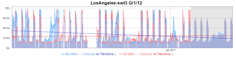
Pushing the reported time frame out to 30 days in the past we see the transmitted traffic trendline has flattened out indicating a very minimal change and a decrease in the rate of change observed in the received traffic.
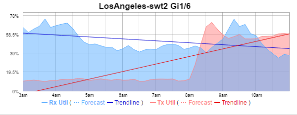
Non-Representative Data
By refining our reporting period to remove those days of the week and times of the day outside of the core operating hours for the services utilizing that interface we see the trendline more accurately reflect the data.